Book Design, Cover Design, Typography
Heritage Terminology: Definitions & Contradictions
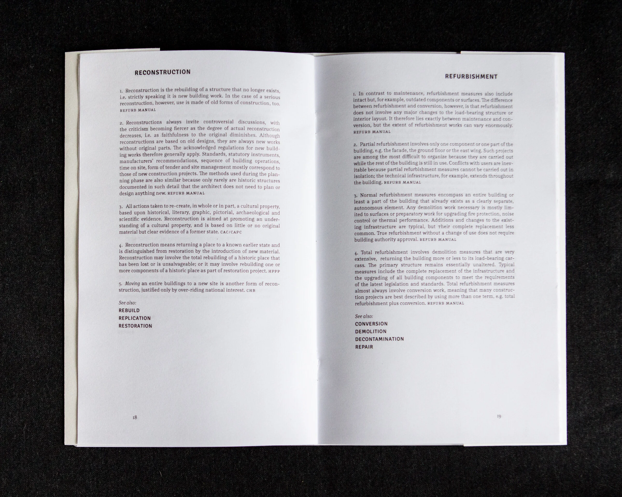
To highlight the nuances and complexity of architectural conservation work, I designed a booklet that contrasts many definitions and interpretations of the same idea. Conceptually these were intended to be part of a participatory editing process and dialogue about how we engage with our cultural and built heritage. Definitions were drawn from over 20 key texts and coded by acronym.
The premise: each participant would take their own copy to mark up and revise as they deemed necessary. They could highlight, circle, or underline their favourite version of each definition, or write an entirely new one in the book.
Designed to be easy to print and produce. The design is clean and draws attention to the content. Typographical choices follow the same philosophy, and the typeface Rail pays homage to the historical content itself. Dimensions are a standard of letter size sheet, folded in half (5.5" x 8.5").


